CSS: position属性
-
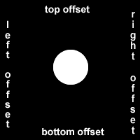
relative:该模式会影响周围的DOM,可以通过top、buttom、left、right调整offset,下图很形象
-
absolute:不同于relative,absolute会锁定当前DOM在父容器的相对位置,这个父容器是最近的position为relative的DOM,会一直向上查找,直到body。同样通过top、buttom、left、right调整offset
-
fixed:也是绝对定位,但是fixed是相对浏览器窗口(browser window),而absolute是相对父容器
-
float:float不采用position属性定义,本身通过
float: left或者float: right定义,float的元素将离开当前document的flow而采用left和right排列在它所在的父容器中
CSS3: display属性
Felx
-
设置
display:flex可以使DOM布局更为灵活(flexible),使得容器内的DOM满足响应式设计需求,随着浏览器窗口变化而变化 -
flex-direction可以指定为row,row-reverse,column或column-reverse -
flex元素和DOM的填充问题:

justify-content:决定子元素在main axis(见上图,主轴)的排列规则:flex-start:默认沿着main axis,从左到右或者从上到下center: 让子元素居中对齐(沿中线对称排列)flex-end:同样沿着main axis,但是和start相反方向space-between: 让第一个元素和最后一个元素紧贴main axis的两侧,其他元素的space相同space-around: 第一个元素和最后一个元素离容器两边的距离是元素之间距离的一半(half),不太好理解的话可以看原文:
similar to space-between but the first and last items are not locked to the edges of the container, the space is distributed around all the items with a half space on either end of the flex container.
space-evenly:等距分布元素(实际测试了一下,肉眼能看出没那么均等)
align-items:决定子元素在cross axis(副轴)的排列规则,和justify-content类似flex-startflex-endcenterstretch(default):如果元素没有定义cross axis的样式,则填充整个cross axisbaseline: 将元素对称到baseline,字符的高度。原文如下:
align items to their baselines. Baseline is a text concept, think of it as the line that the letters sit on.
flex-wrap:决定子元素在main axis排列满之后是否换行,默认是nowrap不换行,子元素关于main axis的样式将被覆盖,flex-wrap有以下可选值:nowrapwrapwrap-reverse
都基本可以从名字看出含义,所以就不解释了
上面都是控制容器的属性,下面是一些控制子元素的属性
flex-shrink: 当子元素超出容器时进行缩小(shrink),值越高,shrink比例越大,例如值为3,就是值为1的3倍
The flex-shrink property takes numbers as values. The higher the number, the more it will shrink compared to the other items in the container. For example, if one item has a flex-shrink value of 1 and the other has a flex-shrink value of 3, the one with the value of 3 will shrink three times as much as the other.
-
flex-grow:和flex-shrink相反,对元素进行放大,填充容器,值得意义也和flex-shrink相同 -
flex-basis: 不同于flex-grow和flex-shrink,flex-basis定义元素在main axis的初始状态(如果样式没定义),值需要是px或em等具体值 - 另外,可以直接用
flex来共同指定flex-shrink,flex-grow和flex-basis。例如shrink为2,grow为2,basis为150px的元素可以添加css:flex: 2 2 150px; -
order,决定flex内部元素的优先级priority,order越大的元素排在越前面,该值可以为负值negative align-self:- 决定单个子元素在flex容器中的对齐方式
- 这个属性很常用,因为通常使用在css中的
float、clear和vertical-align在flex的display中均无效 - 接受任何
align-items的值,并且会覆盖其值 - 有align-self调整元素自身的cross-axis对齐方式,但是没有justify-self,因为可以使用margin来控制main-axis对齐方式,例如`margin-right: auto`,元素会从右侧对齐
Grid
Grid可以让容器内元素按指定格子(grid)分布,元素的排列顺序为从上到下,再从左向右(符合用户使用习惯),可使用属性包括
grid-template-columns: 将一行分为指定的列数,可指定单位包括- auto: 默认,按照元素内容自动分配最少所需空间
- px
- em
- %:容器的最大width比例
- fr:将其他类型的元素分配完成后,剩下的部分按照指定的fr总数进行分片(franction),并按照给定的fr数量进行分配
如果元素指定的大小超过容器大小,则会溢出(超出容器范围)
另外有一些
built-in的属性:repeat:删除相同重复的定义,例如:
grid-template-columns: repeat(2, 1fr 50px) 20px;等同于
grid-template-columns: 1fr 50px 1fr 50px 20px;-
minmax:指定item的最小最大范围,还可以结合repeat使用,例如repeat(3, minmax(60px, 1fr)); -
auto-fill:自动按最小的大小填充,当container大小不够时,会自动换行元素,详细解释如下:

auto-fit:和auto-fill相似,区别在于auto-fit会自动填充container而不是采用minmax的min,形象的区别见下图

-
grid-template-rows: 和columns类似,将元素分为指定行数,使用单位和columns相同 -
grid-column-gap: 指定column之间的gap -
grid-row-gap: 指定row之间的gap -
grid-gap: 指定row和column之间的gap,例如10px 20px,前面是row,后面是column -
grid-column: 指定grid元素占用的column line, 关于line的解释如下
例如指定
grid-column: 2/3则表示从line 2开始,到line 3结束 -
grid-row: 和grid column类似 -
justify-self: 指定grid cell内部内容对齐方式,支持stetch(填充整个width),start,center和end -
align-self:和justify-self对应,justify-self控制row,align-self控制column -
justify-items:justify-self是cell的属性,控制具体的某个cell,justify-items是container的属性,控制内部所有cell -
align-items:和justify-items对应 -
grid-template-area:创建一个自定义area的template,例如grid-template-areas: "header header header" "advert content content" "footer footer footer";代表最上面一行area的名称是header,中间左边1/3名为advert,右边2/3名为content,最下面一行名为footer
接着,你在具体的cell中指定
grid-area属性(例如grid-area: footer),就可以将cell放入对应的area另外,如果没有指定teamplate,
grid-area也可以使用,指定潜在的line即可:item { grid-area: 3/1/4/4; }其含义是
grid-area: horizontal line to start at / vertical line to start at / horizontal line to end at / vertical line to end at;可以看出,如果用上面的template例子,这个item就对应的footer
-
@media:可以更好地面对响应式的设计,当media满足对应的条件时,调整样式,以满足不同设备的设计需求,例如:.container { font-size: 1.5em; min-height: 300px; width: 100%; background: LightGray; display: grid; grid-template-columns: 1fr; grid-template-rows: 50px auto 1fr auto; grid-gap: 10px; grid-template-areas: "header" "advert" "content" "footer"; } // 当media宽度超过300px时,container属性将变换 @media (min-width: 300px){ .container{ grid-template-columns: auto 1fr; grid-template-rows: auto 1fr auto; grid-template-areas: "advert header" "advert content" "advert footer"; } } // 当media宽度超过400px时,container属性将变换 @media (min-width: 400px){ .container{ grid-template-areas: "header header" "advert content" "footer footer"; } }